Spline, a 3D design tool, was launched towards the end of 2020. As you probably know, it’s not your typical 3D environment like Blender, 3D Max, or Cinema 4D. For instance, it doesn’t allow you to edit meshes. You could say Spline is more like three.js editor, but unlike this tool, Spline is codeless. It also feels more designer-friendly to me.
When I tried Spline for the first time, it felt like 3D Paint but with interactions. It seems that this is how the Spline team wants to position their product on the market. This impression is further supported by the eye candy aesthetic you will notice when browsing the library of projects.
For me, the biggest upside of Spline is its “magic-doing”—and yes, “doing magic” is the message you see when exporting your project to a browser. Spline’s speed, performance (web and mobile), and simplicity make it easy for 3D designers to showcase their work in a browser using just WebGL, not a built-in player, which is the case for Sketchfab.
You may also like: Augmented Reality in Healthcare
I really appreciate what other creators achieved with Spline and the general aesthetic emerging in the Spline community. Spline’s Twitter and Instagram accounts prove that many designers got on the bandwagon, and the published works can be truly breathtaking. Usually, these are the scenes where artists tried to enhance the content predominantly based on Spline’s native interactions: rotate, zoom, pan.

Working at Apptension, a software house where interaction is crucial, I decided to take a different route. I asked myself: how complex can Spline-based interactions be? Can I use them to tell a story? Can I have more than one rotating scene? Can I achieve, as Ryanne Fadel tweeted, a Prezi on steroids?
I tried to answer these questions with a project illustrating the 10 principles for good design by Dieter Rams, which you can look up here. Below there is also a Youtube video with the similar 3D web design Spline tutorial.
Let’s explain how I built it.
Start with an idea
Our Design Director, Bartek, came up with an idea to use Dieter Ram’s principles in my project. As Bartek pointed out, the 10 design commandments have yet to be presented in a way that’s interesting, innovative, and tailored to the design master himself. I couldn’t disagree.
Together, we decided that the very items that Rams designed for Braun would be the best illustration of his design principles. The goal was to create 3D design models of these items and display them in a virtual, minimal gallery.
Proof of Concept
After my first attempts at creating everything, including objects, in Spline, I realized that I have to redefine my “all in Spline” approach. Granted, building models with primitives within Spline is possible.
However, I’d have to make some concessions when it comes to the accuracy of the objects and create simplified, low-fi interpretations of them. It didn’t feel right, and I certainly didn’t want to end up with a botched version of design classics. If history is any indication, art reconstruction should be done with due diligence.

Instead of diving into the time-consuming process of setting up cubes in Spline, I decided to use Cinema 4D, which I use as a native 3D app, and look for models of Ram’s designs there. After a lot of digging and hours of modeling, I’ve managed to prepare 3 objects.
This part of the process is not about Spline, so let’s quickly recap what I did. I prepared the full scene in Cinema, skipped the lighting, materials, and so on. I only focused on the objects themselves and setting them up in their space. I intended to work on the interaction in Spline.
Tips before you deep dive into this Spline tutorial:
- It’s a good idea to connect even very complex objects into one object. The same goes for textures—everything should be on a single UV map. It definitely improves Spline’s performance. Does that mean that all meshes made of the same material and intended to behave in the same way should be a single object? This way, it will be easier to control them, and the performance of your animation/interaction will be much better.
- Spline works for Obj, Fbx, Gltf file formats. I used Fbx, and it worked just fine.
- Interestingly, when you plan to have titles in your scene, you better prepare them as 3D objects. When your scene is complex, using Spline’s native text feature negatively affects the performance. Why was that the case? I don’t know, perhaps Spline’s creators could explain that.
How does the camera work?
Let’s start from scratch. Create a new project in Spline
Quick tip #1:
- Name your project and save it right away. I would also suggest saving your projects to a local drive as well.
Now we can import the previously created scene to Spline. Click on the burger menu and pick open/import. Find the path or your scene’s file (I used an .fbx file) and click open. You should see your scene in Spline’s main window and the structure of objects on the left.
Quick tip #2:
- It is also an ideal moment to validate the performance of your scene. Export it and check how it works in a browser. If possible, verify its mobile performance as well. If it works smoothly, then you didn’t use too many polygons in your scene.
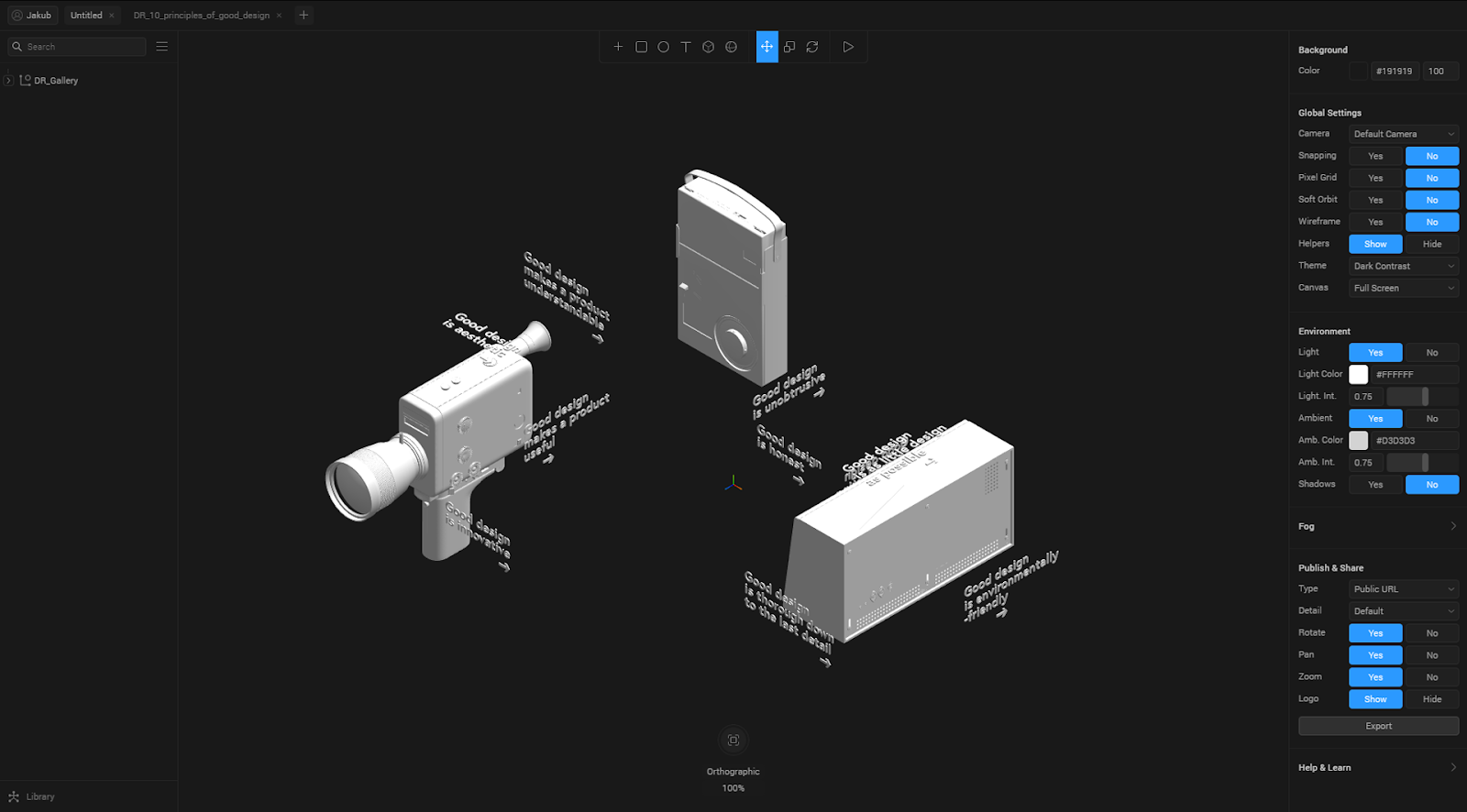
You won’t be able to find the camera in the object explorer. It means that, at this time, Spline works in the default camera mode, and the scene is displayed from the front in the Orthographic view. It may remind you of pixel art, where you would design in an isometric view.
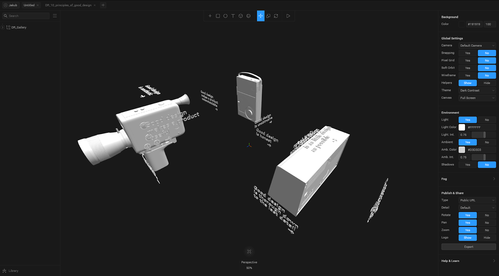
The comparison of two camera views:
Orthographic

Perspective

I decided to go with the Perspective view as it felt more natural in this case. To set this view, you need to go to the top menu and pick Camera. A new object will appear on the list in the object explorer, and you’ll see the camera’s avatar in the main panel.
Choose the Perspective view from the window on the right side of the camera. Nothing will change in the main panel because you still see the default camera view. Change that by going to Global Settings > Camera and switch Default Camera to your Camera.
It’s time to pick the frames that will become the “slides” in our “presentation”. Save the chosen frames as Camera State. When you find the right frame, the one you want to begin with, make sure that the Camera object is selected in the explorer. Click on the plus icon next to the States option in the window on the right side.
Might be interesting: What Is a Hybrid App Development?
Spline will automatically create two states: the Base State and State 1. Let’s say that the Base State is our initial state, the one for which we have already picked a frame. Now click on State 1. When it’s active (highlighted), you can select the frame for the second slide in your presentation.
Quick tip #3- There are two ways to do it!
- Change the frame in the viewport using alt + drag to rotate the camera, ctrl + scroll to zoom, and mouse scroll to change the camera’s position in the X-Y axis.
- Switch to the default camera and move the Camera’s avatar around your scene. It’s useful to control the camera’s position by putting numerical values in the Camera’s settings.
Now that you have set up two states: Base State and State 1 make sure that these frames are connected to States in the right fashion. You can do that by switching between states in the Camera’s States window. Add the next frames using the same steps.
Let’s add some interactions!
Quick tip #4:
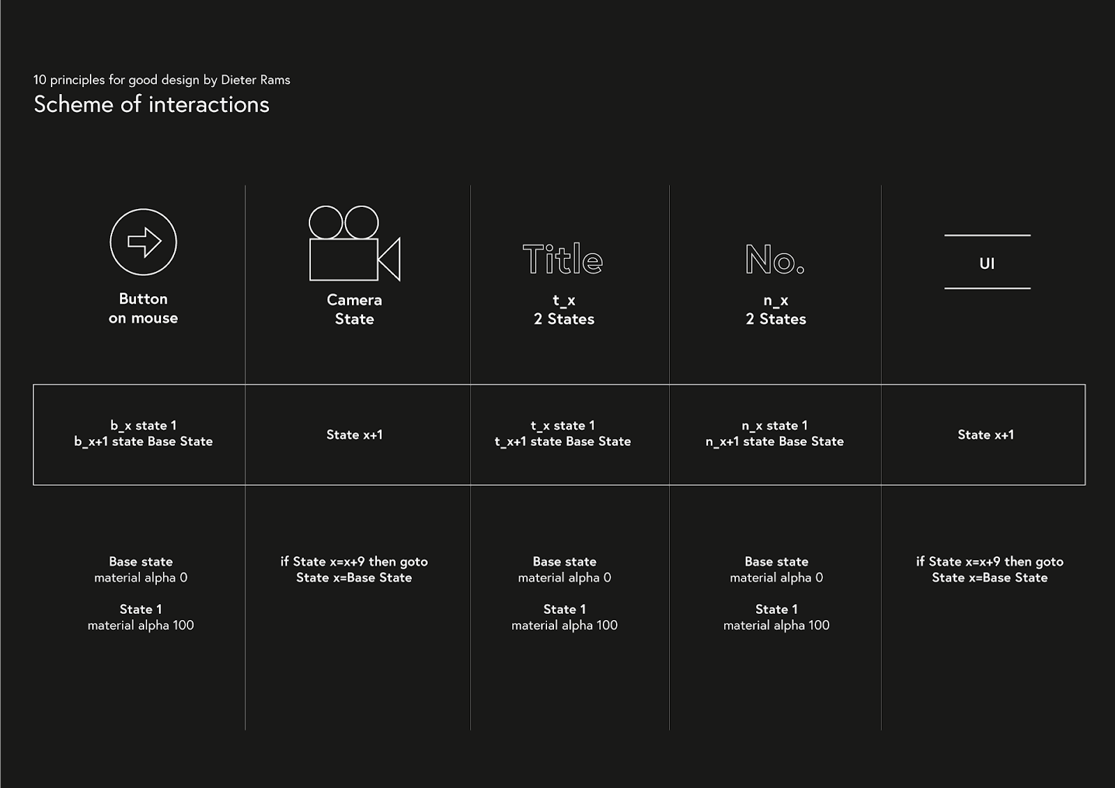
- before you add your first interaction, it’s good to have a scheme of all interactions you want to use. Here’s what I’ve prepared for my project:

Let’s finally add some interactions! In Spline, you will add interactions using Events. Events belong to an object and allow you to control the object they’re assigned to but also other objects in the scene, changing their State.
It works the following way:
.png)
In our case, one object will control multiple other objects. To be precise, one object and its instances will.
The object in question is this button, and we will be adding events to it and its instances.

The camerawork
Let’s start with the simplest interaction: moving the camera from one slide to another. The first step is ensuring that you have selected the right object. In our case, it’s the button that should trigger the interaction upon clicking. You can add an event in the column to your right by clicking on the plus icon next to Events. Below, a new window will appear where you can describe the interaction.
Pick Mouse down from the drop-down menu. In the Object field, you should select Camera because that’s what we want to control. In the State field, you can choose the state you want to get to upon clicking. In our case, we will choose State 1 because initially the camera is in the Base State. The next two options you can configure are Cycle and Repeat, but let’s skip them for now. In Transition, select Spring from several available options.
We have now defined the type of animation that will accompany the change of state from the Base State to State 1. When it comes to parameters, type: Mass: 3, Stiffness: 20, Damping: 10, Velocity: 0, Delay: 0. These settings worked best for me but feel free to experiment on your own. You can read more about interactions here.
Let’s verify if our interaction works correctly. Click Play et voilà!
Adding extra actions to the event
Now that we’ve figured out how to operate the camera, it’s time to move on to other interactions. In my project, as shown in the interaction scheme, I want to control a couple of objects: fading out the old titles and making new titles, numbers, and the button’s instances appear. On top of that, I want to change the location of an element I’d like to call the UI.
As it was the case with camerawork, we will use events to trigger these actions. To be more specific, we will add new actions to the existing on mouse down event. You can do that by clicking Add new object to event—the button is located below the camera’s event description.
Also read: No-code SaaS – guide on how to build products without coding
A new window will show up, just like the one you used to set up the camera’s event. You can utilize this event to manage the button. In our scenario, we want to make the currently used button disappear upon clicking. We won’t need it in the next slide.
To achieve this, you can introduce two states for this button. There’s no need to change the object’s position, just its material’s settings—Base state Texture 100% and State 1 Texture 0%. In the window where you can describe the second interaction, you should select the button’s name in the Object field. Set State to State 1, select Easy in Out in the Transition field and pick a low value for the Duration, for instance, 1.
Let’s see how it works—click Play. You should see an interaction for the camera’s movement as well as the disappearing button. All you have to do now is add more actions to Events to trigger all of the planned interactions upon clicking the button. Here’s where the scheme of interactions is particularly helpful.
The interaction loop
At this point, you should have been able to add all of the actions to your event—in my case, we’re talking 8 actions. You’ve clicked Play and it works! Great, but you might be slightly disheartened when you realize that this is all just to make the transition between the first “slide” and the second one. When you have many slides (I have 10), it’s simply a lot of work.
Granted, you have to repeat this step for all of the slides, but you can do it the smart way. Unfortunately, Spline currently doesn’t allow you to copy events from one object to another. However, the workaround is to duplicate the object itself.
Worth checking: What is a boilerplate? Meaning, history and examples
In my case, the object is a button that should look the same on all slides—even better! You can duplicate the button X times and set it in the correct location on different slides. Having the scheme of interactions at hand, you can simply change the events’ parameters so that they work for each of the slides.
Quick tip #5:
To avoid mistakes when duplicating buttons, you should do it one by one. Button > duplicate > select the duplicated button > set it in an appropriate position in the scene > change parameters in Events > verify it in the presentation mode > export to the browser. If everything works fine, you can move on to the next button. If not, at least you know where to look for the bug.
When it comes to interactions, I’ve also managed to achieve an interesting parallax-like effect by picking a different type of Transition, e.g. Spring and Easy In Out, for the objects that move around the scene.
3D Spline Design - summing it all up
I didn’t dive into all of my projects’ details: designing the materials, lighting, etc. You can download the project and analyze the aspects that interest you the most (CC license).
Final thoughts and tips for creating web experiences with this Spline 3D tutorial:
- After implementing crucial changes in your scene, export it to the browser. It will be easier to find mistakes right away.
- For that same reason, it’s good to utilize project versioning and save your work after every important edit.
- Test your projects on different devices. You’ll have a chance to see how well Spline design works for mobile.
- Make sure you're equipped with the right computer for 3d modeling.
Looking for more advanced design resources? Check out our DesignOps ebook.


